
The knight beyond Burberry’s wordmark
From the TB monogram on a 2018 T-shirt to the knight on a 2026 bag, Burberry’s marks have changed places as well as forms.
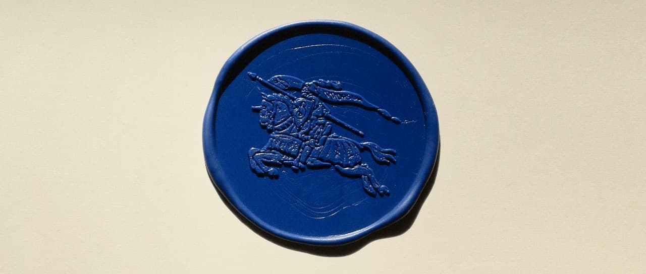
On Burberry’s heritage page, the Equestrian Knight Design is pressed into blue wax. The horse, rider and lance appear in relief. It is a useful place to begin: the mark changes character when it moves from a flat image to a material surface.
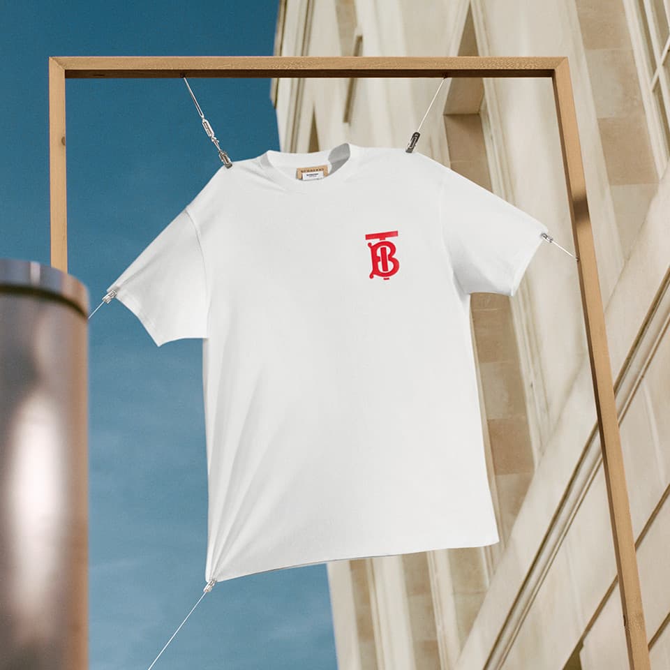
In 2018, Burberry worked with graphic designer Peter Saville on a new logo and a Thomas Burberry monogram. A white T-shirt from the house’s B Series puts the red, interlocking TB initials at the centre of the chest. The knight had not disappeared—Burberry’s own history records its use in the AW18 archive reissues—but the new initials gave the house another graphic to repeat across products and campaigns.
The emphasis changed in February 2023. Under Daniel Lee, Burberry introduced an archive-inspired wordmark and a refreshed Equestrian Knight Design. The rider dates to a public design competition around 1901; the banner carries “Prorsum”, Latin for “forward”. On the wax seal, the old drawing becomes a raised pattern. It can hold detail that the compact TB initials leave aside.
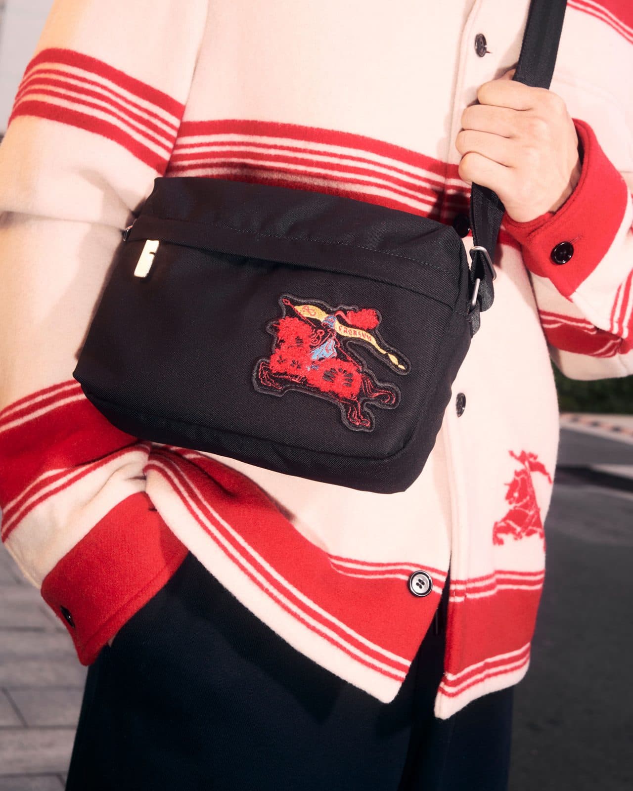
By 2026, the knight was appearing in another register. For its Year of the Horse collection, Burberry described watercolour and ink reinterpretations of the motif across clothes and accessories. One campaign image shows a coloured rider on a black bag. Here the mark sits close to the body, read first as a patch and then as a piece of the house’s history.
C33’s earlier essay asked whether fashion had put away its serifs. Burberry suggests a more precise question: which mark does a house ask us to notice, and where? A wordmark can identify a page or a storefront. Initials can become a pattern. The knight can be printed, embossed or worked into a garment. The shift is visible in the objects, not only in the letters.
Sources & further reading
- Burberry · 2018/19 annual report, visual identity ↗
- Burberry · B Series and TB monogram, 2018 ↗
- Burberry · Daniel Lee’s first brand expression, 2023 ↗
- Burberry · The Equestrian Knight Design ↗
- Burberry · Year of the Horse collection, 2026 ↗
Keep reading
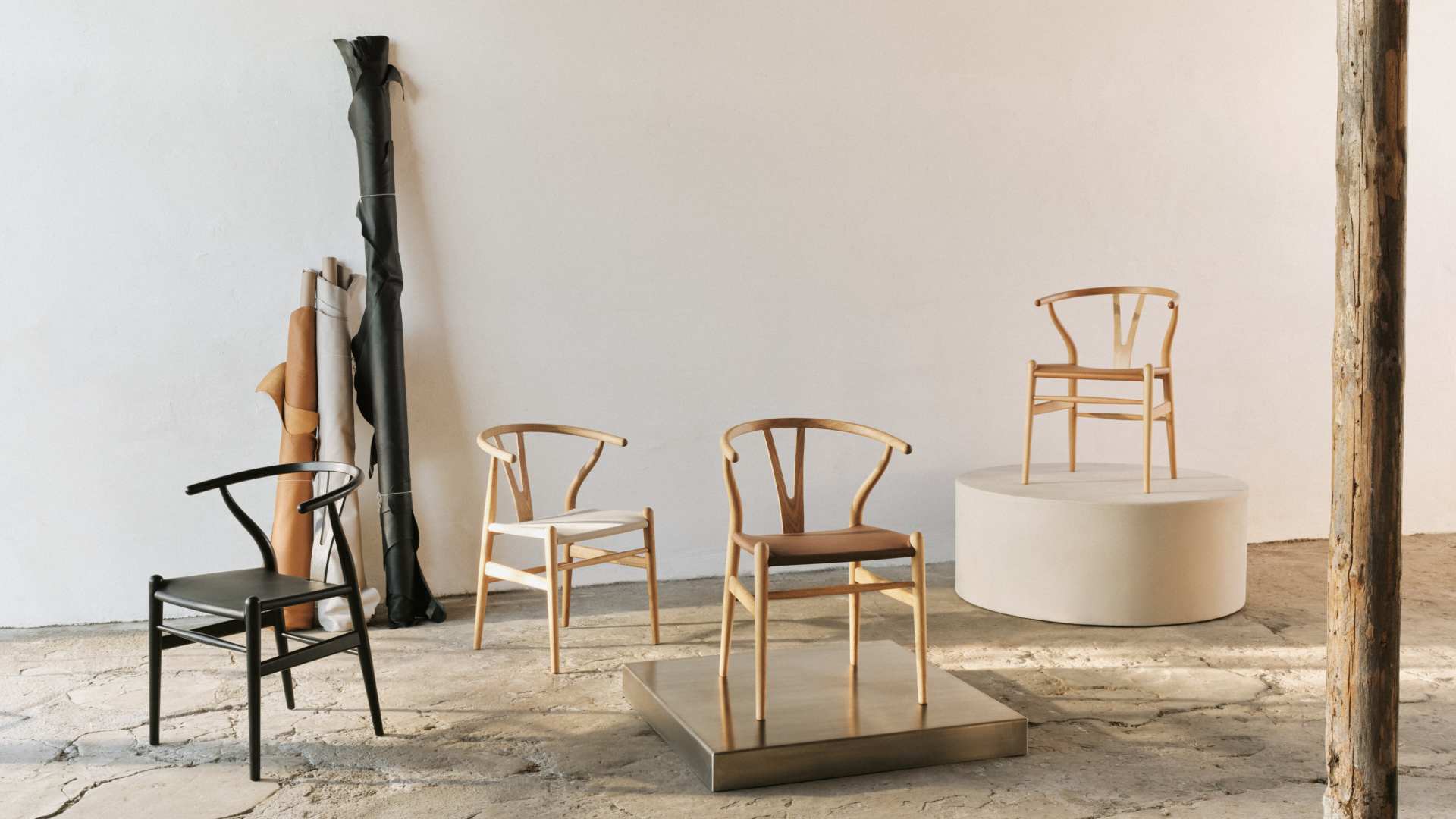
The Wishbone Chair changes its seat
Carl Hansen & Søn has introduced a leather-seat CH24. Wegner’s familiar frame stays; the change is in the place we sit.
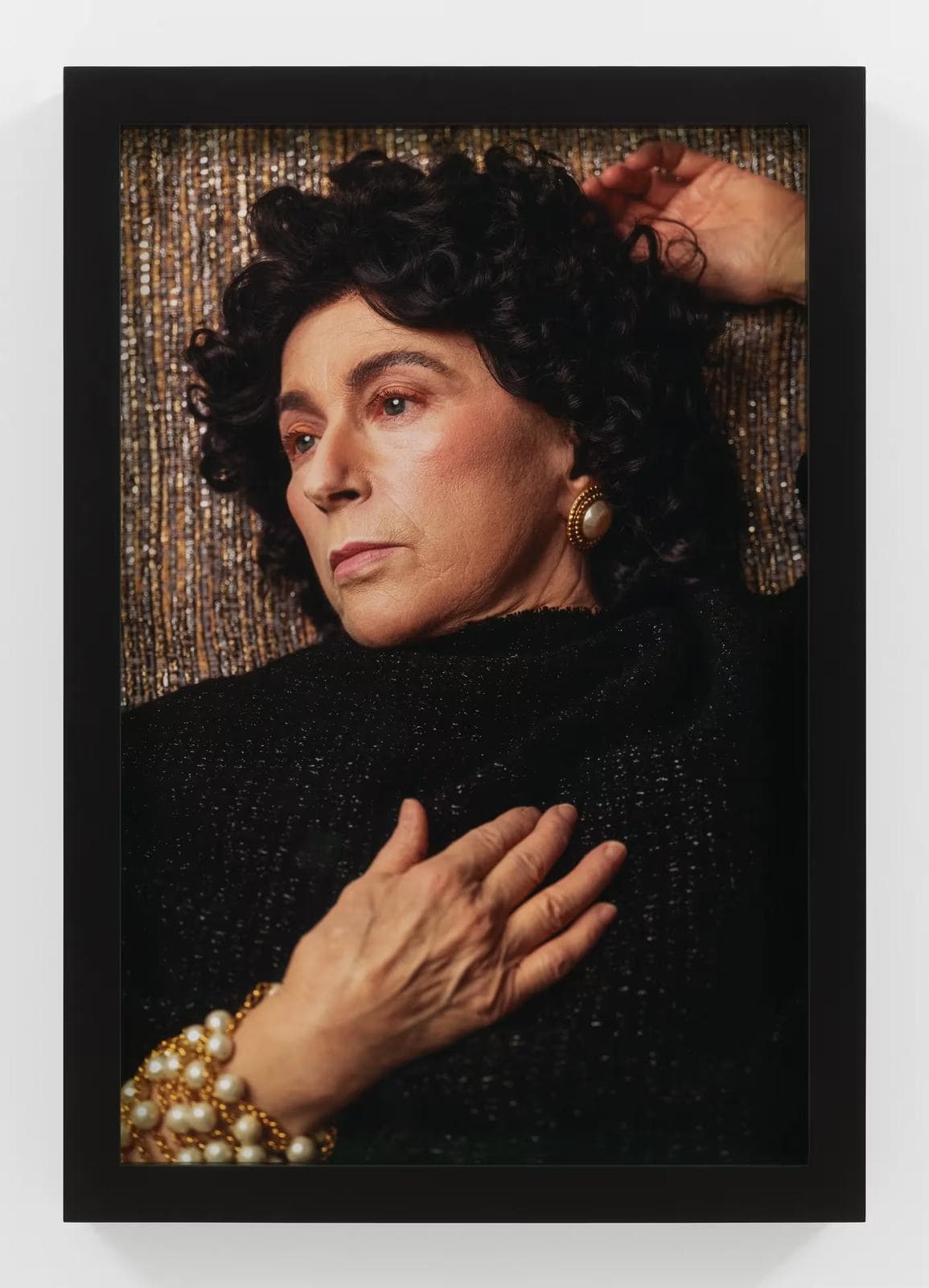
Cindy Sherman, dressed to disappear
In Fabric Matrons, fabric is both costume and setting. Sherman uses fashion’s polished surfaces to examine what it means for a woman to be seen as she grows older.
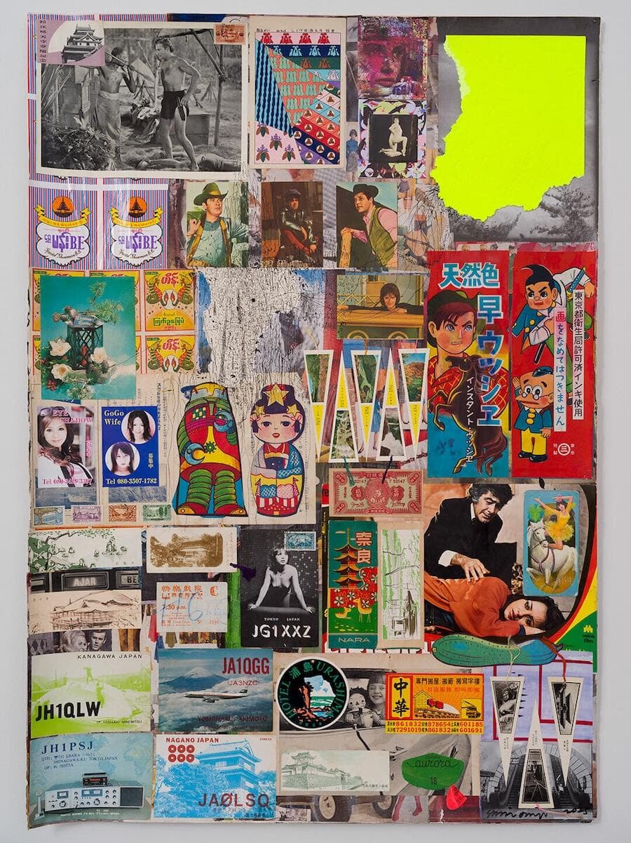
Frieze London: from scrap metal to ink in The Code Universe
In Carol Yinghua Lu’s curated section, Shinro Ohtake, Selma Selman, Oototol and Payne Zhu approach popular culture through very different materials.